
Spot Gold vs 10-Year Real Yield (Inverted)
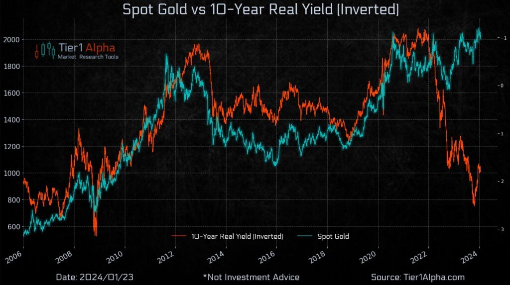
The advent of gold ETFs in the United States in 2004 marked a pivotal shift in the investment landscape, fundamentally altering gold’s role in the financial markets. Historically, gold’s price was static, or it was seen as an illiquid asset tucked away in the coffers of a select group of investors. The dynamic has transformed forward to today: gold has become a highly liquid financial asset. This transition is underscored by the sheer volume of gold held by ETFs in the U.S., surpassing $100 billion. In this new era, the marginal price of gold is not anchored to its physical allure but is driven by its financial demand. Investors now juxtapose the expected real return of gold against a suite of other liquid financial assets. Consequently, it’s reasonable to posit that gold’s future behavior will mirror the patterns established in recent decades, detaching from historical precedents such as those of the 1970s.
Here are some analytics for you, looking at the interplay between real
gold prices and real yields from 2006 through 2022. Using a regression model with the logarithm of real gold prices against the 10-year TIPS market yields, an inverse correlation presents itself: a 100-basis-point uptick in real yields typically precipitates a 22.2% contraction in real gold prices. This ‘real duration’ of gold, while purely empirical and subject to fluctuation akin to the variable correlation between equities and bonds, is a testament to gold’s responsiveness to macroeconomic forces. For instance, the significant dip in gold prices in April 2013, preceding the spike in fixed income yields, corroborated the historic ‘real duration’ metric, suggesting that gold prices can serve as a harbinger for shifts in yield landscapes.
Yet, when we adjust the gold price for movements in real yields,
we gain a more nuanced understanding of its valuation over time. The
‘real-yield-adjusted gold price’ offers a lens that factors in the fluctuating
the opportunity cost of holding gold. While not a panacea for all price movements, this adjustment reveals a more constrained range of fluctuation, barring episodes of extreme inflation as witnessed in early 2022. The launch of gold ETFs and significant market inflection points like the 2008 financial crisis have undeniably influenced gold prices by altering investor demand or risk perception. Nonetheless, the empirical evidence underscores real yields as the dominant factor in determining gold’s price, solidifying its status as a financial asset. As such, in a milieu where real yields are rising, gold prices should ostensibly decline to maintain equilibrium in investor demand. Conversely, an ascension in gold prices can be anticipated if real yields fall.
New Privately-Owned Housing Units Under Construction

The chart provides a visual representation of the new privately-owned housing units under construction over the past several decades, contrasting single-family units with those in buildings with five units or more. From the data, we can observe significant trends in housing construction that align with demographic and economic shifts.
Since 1980, the median age of first-time homebuyers has increased from 29 to 35 years old. For repeat homebuyers, the median age has risen even more sharply, from 36 years old in 1980 to 58 years old in 2024. In other words, first time homebuyers today were the same age that homeowners in the 1980’s were buying another home. This shift is indicative of broader socio-economic changes, including delayed milestones such as marriage and family formation, as well as the impact of financial constraints like student debt and of course affordability.
Existing home sales are below the levels seen in 2008, this makes new construction a more attractive option for potential buyers. The median existing home price has risen by 4.4% year-over-year to $382,600, which is contributing to the lower sales in existing homes as buyers may be priced out of the market.
Inventory levels are running 40% below their historical average, exacerbating the housing affordability issue. This shortage in supply is likely contributing to the rising prices and making it more challenging for first-time buyers to enter the market.
In summary, the chart and the accompanying data underscore the ongoing challenges in the housing market, with significant implications for affordability and the accessibility of homeownership, particularly for first-time and repeat buyers. The rise in median age of homebuyers reflects deeper demographic and economic trends, and while new construction presents an opportunity, the market’s dynamics continue to pose barriers for many aspiring homeowners. We have a broadening affordability crunch.
NAAIM Exposure Index to US Equity Markets
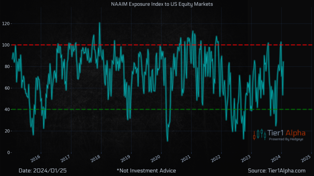
The chart presents the National Association of Active Investment Managers (NAAIM) Exposure Index and its fluctuations from 2016 to early 2025, providing a measure of active investment managers’ average equity exposure. The index stands at 84.13, up from 53.54 the previous week, indicating a sharp increase in managers’ bullishness on U.S. equity markets. The NAAIM Index is a sentiment indicator, particularly revealing at its extremes; readings above 90 typically suggest overexposure or extreme bullishness, while those below 40 suggest underexposure or bearish sentiment among active managers.
These extremes can be valuable for gauging market sentiment. When the index is above 90, it suggests that investment managers are highly confident and heavily invested in the market, which can sometimes precede market pullbacks as sentiment reaches overly optimistic levels. Conversely, readings below 40 can indicate excessive pessimism, which may occur near market bottoms, suggesting a potential turnaround as managers are excessively defensive. The index’s current level indicates a strong bullish consensus but not quite at the level that traditionally signals extreme sentiment. Notably, these managers have the discretion to change their market exposure quickly, which can lead to rapid shifts in the index.
NAAIM is one of our favorite contrarian indicators, particularly at those extreme levels mentioned. The data comes out every Thursday. It will be interesting next week to see if these discretionary managers are at excessive levels of equity exposure. If we slip into negative Gamma coupled with extreme levels of systematic exposure to deleverage, we have a recipe for an interesting February.